Clean Republic is a company that has a variety of brands under the umbrella company. These brands are Dakota Lithium, Dakota Nanotech, and Hilltopper Electric Bike Company. Below are a few samples of marketing assets I worked on as the in-house creative.
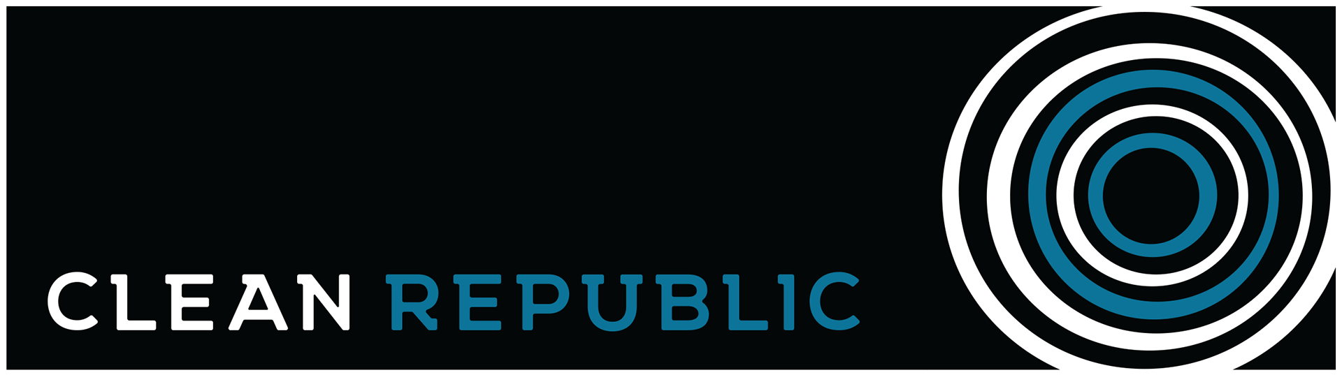
CLEAN REPUBLIC
Clean Republic's focus is to create solutions for sustainable communities. I did not want to go with the basic green leaf or recycling motif. I wanted to capture and illustrate the ripple effect the company creates from its products. So I created a stylized ripple on the pond and used a slab serif font to give it a Northwest vibe. Here is the logo and avatar.
Clean Republic had multiple brands. The main two were Dakota Lithium, which made up 95% of the revenue, and Hilltopper Electric Bikes.
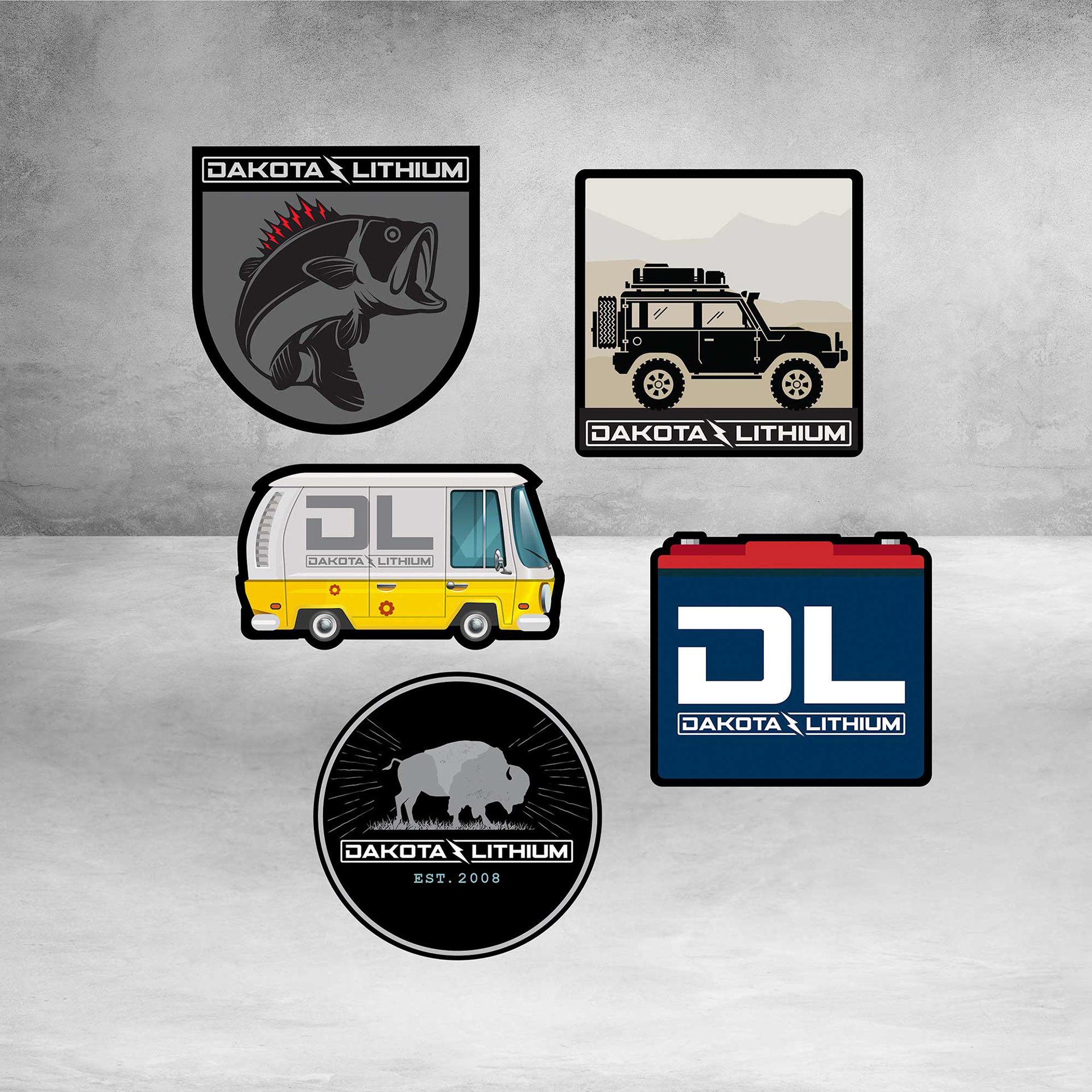
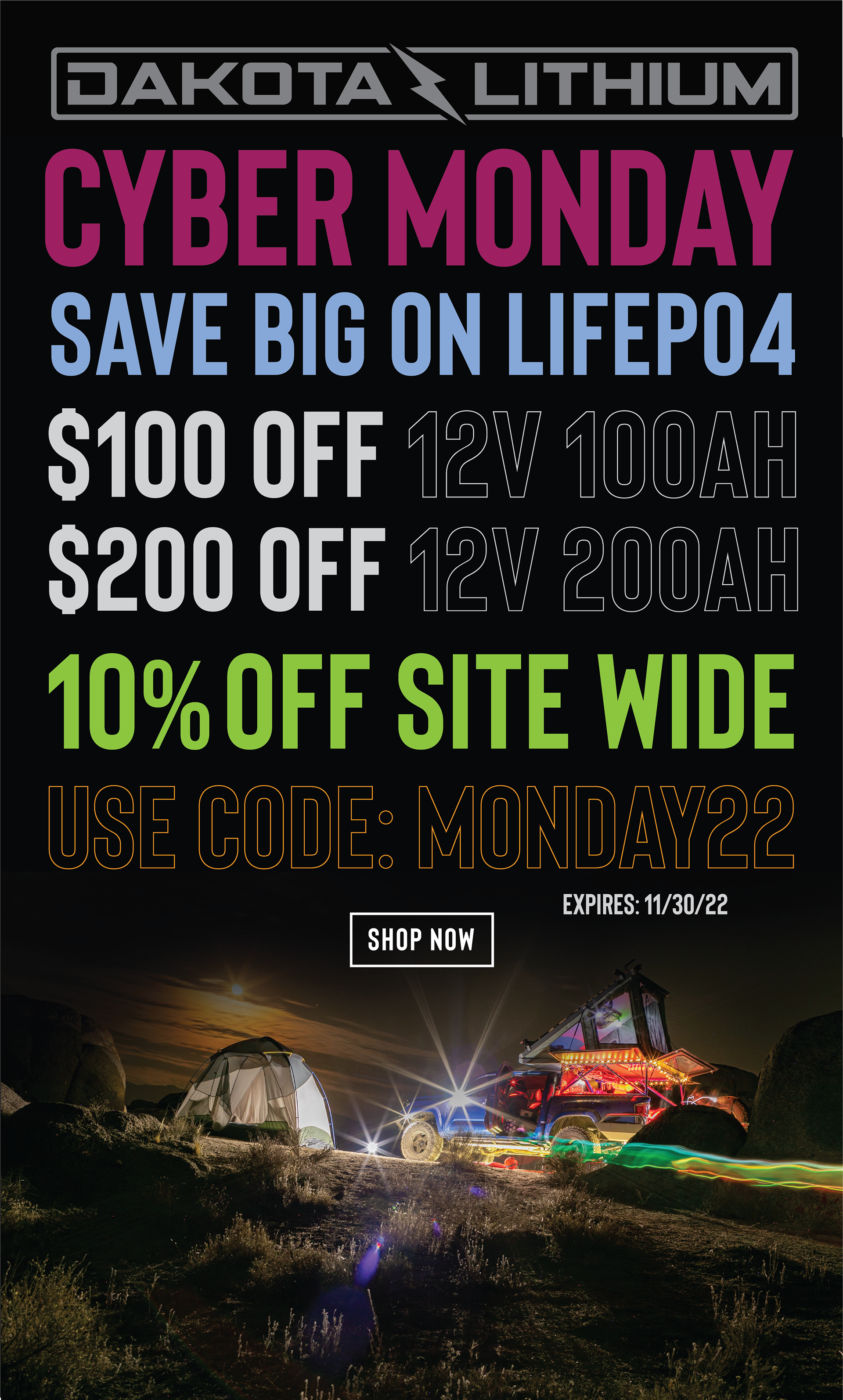
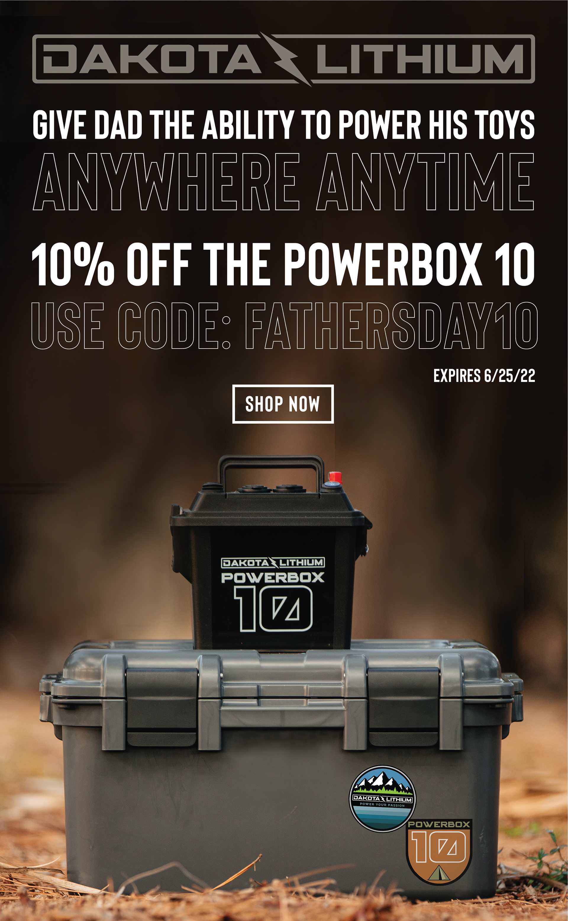
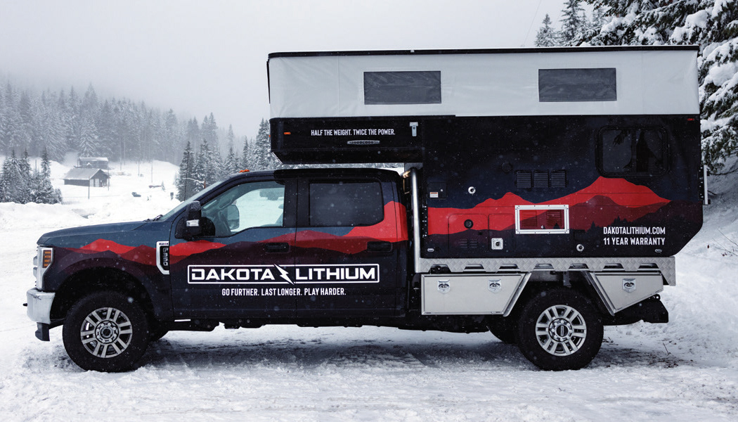
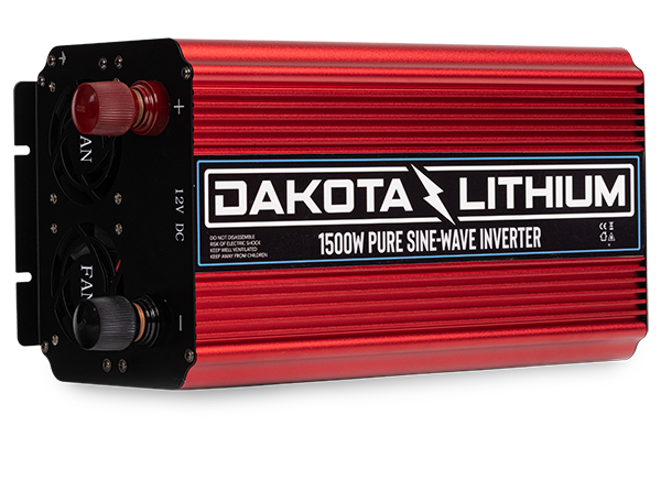
Most of my time as the creative director for Clean Republic was maintaining and growing the Dakota Lithium brand and creating all the marketing assets, social content, packaging, and technical support materials.
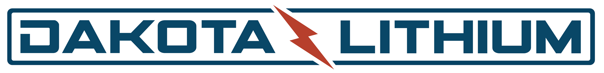
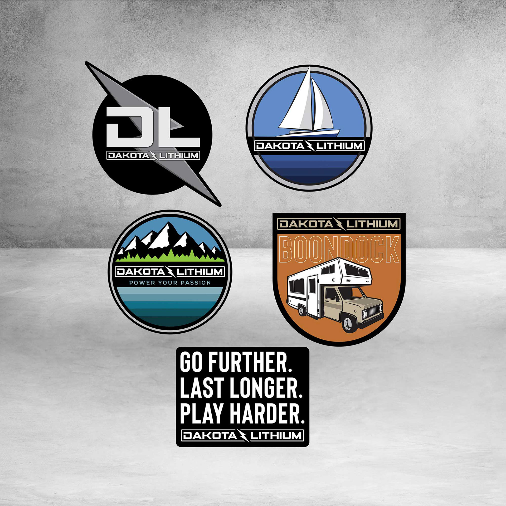
Dakota Lithium manufactures lithium iron phosphate batteries The original logo looked similar but had an enclosed surrounding box. I updated it to have the lightning bolt coming out of the box. This gives it a lighter feeling.
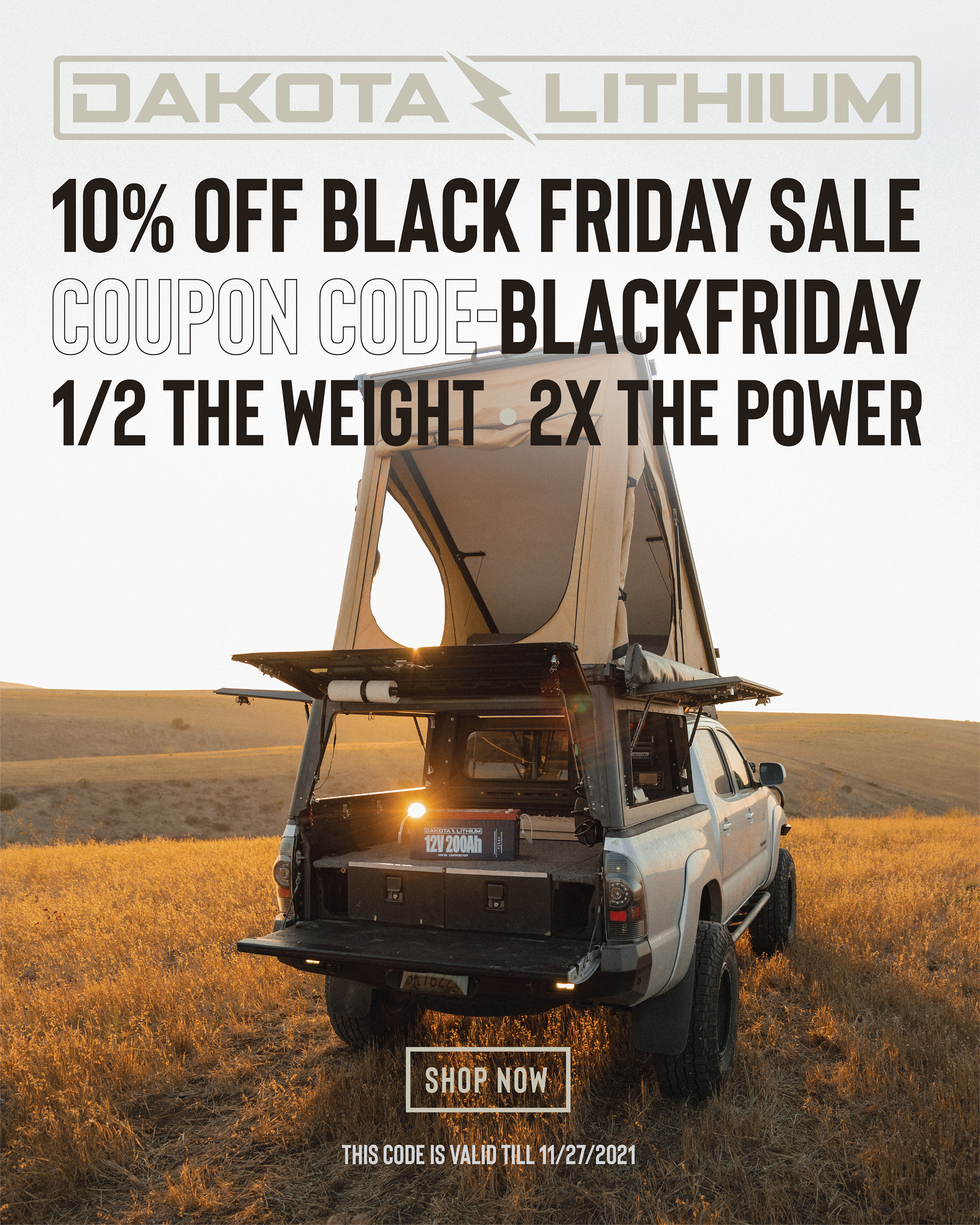
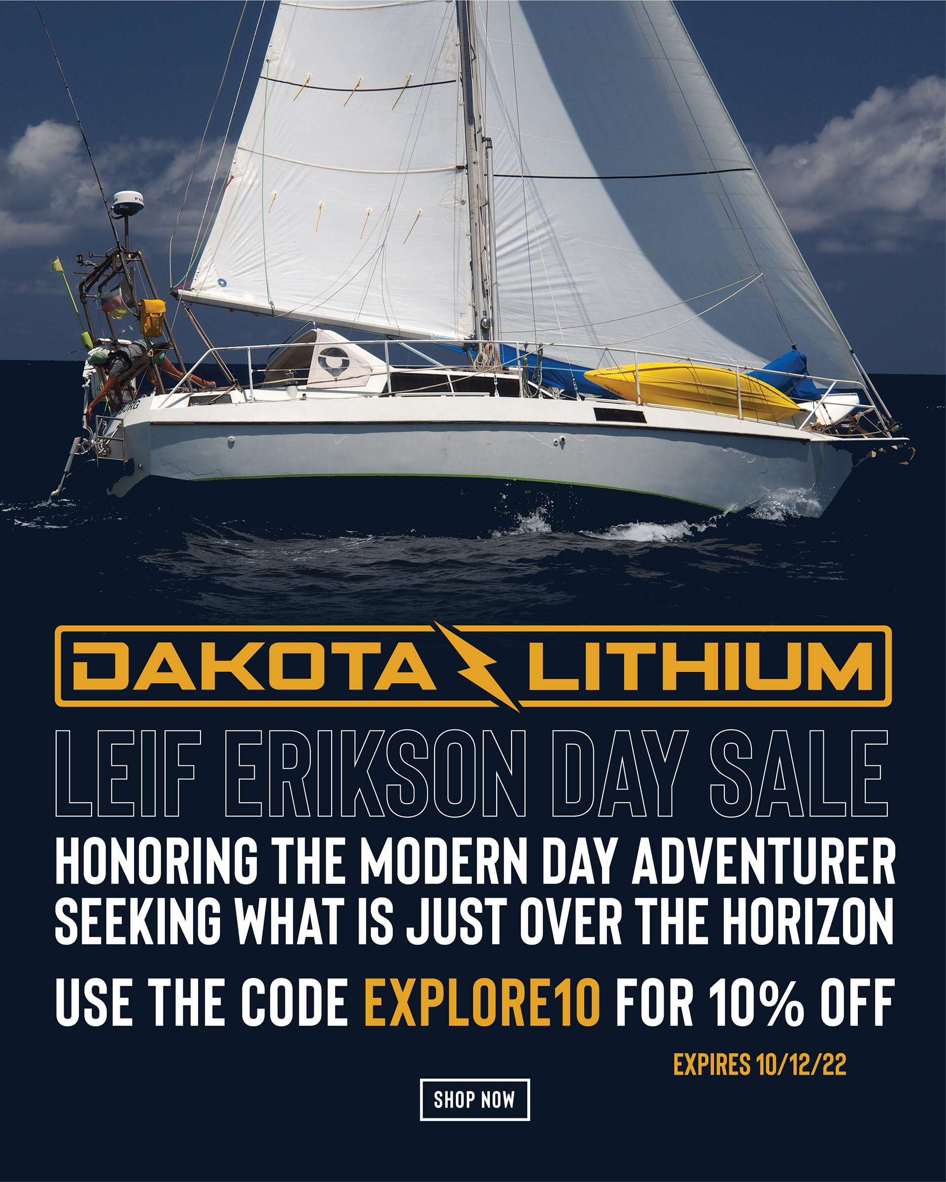
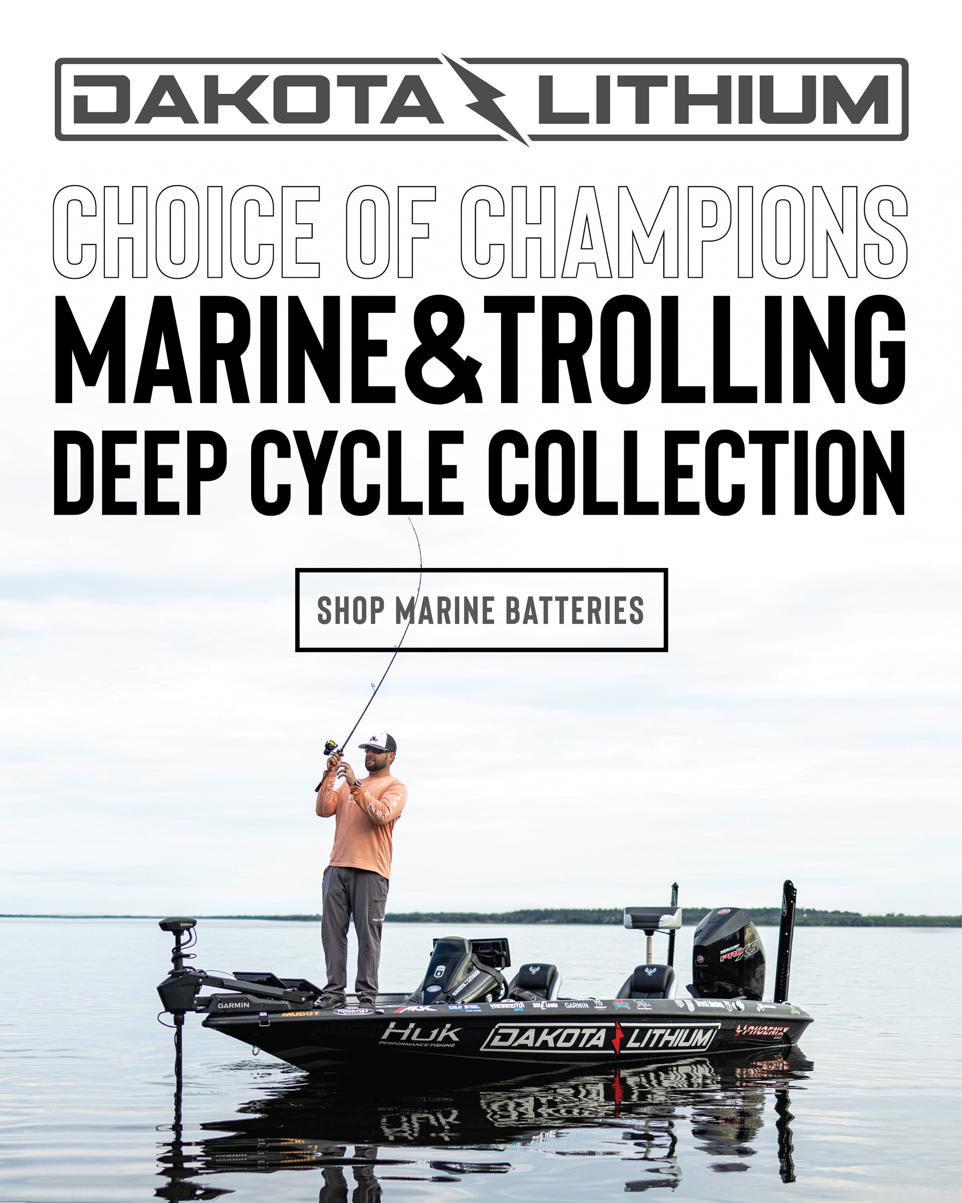
The brand targets a wide variety of markets from bass fishing to overland to van life to high-end sailboats. The challenge was creating marketing assets that appealed to these distinct market personalities while still keeping the core Dakota Lithium branding look and feel.
Most of the sales were through e-commerce with some OEMs, dealers, and chain retailers.


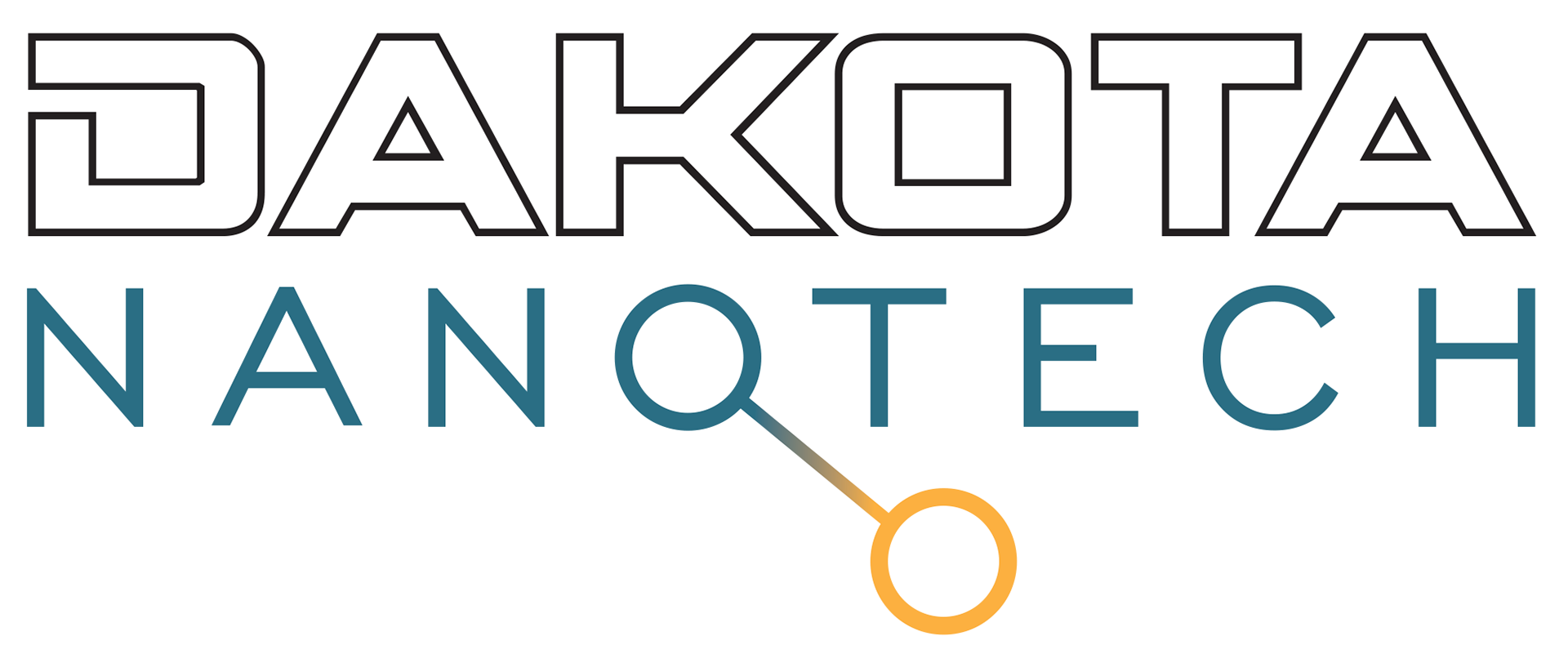
DAKOTA NANOTECH
Dakota Nanotech is an offshoot of the Dakota Lithium line. It is the powder used in the battery cells and will be sold through B2B channels. I wanted to still keep the Dakota lineage front and center but give it a more technical feel.

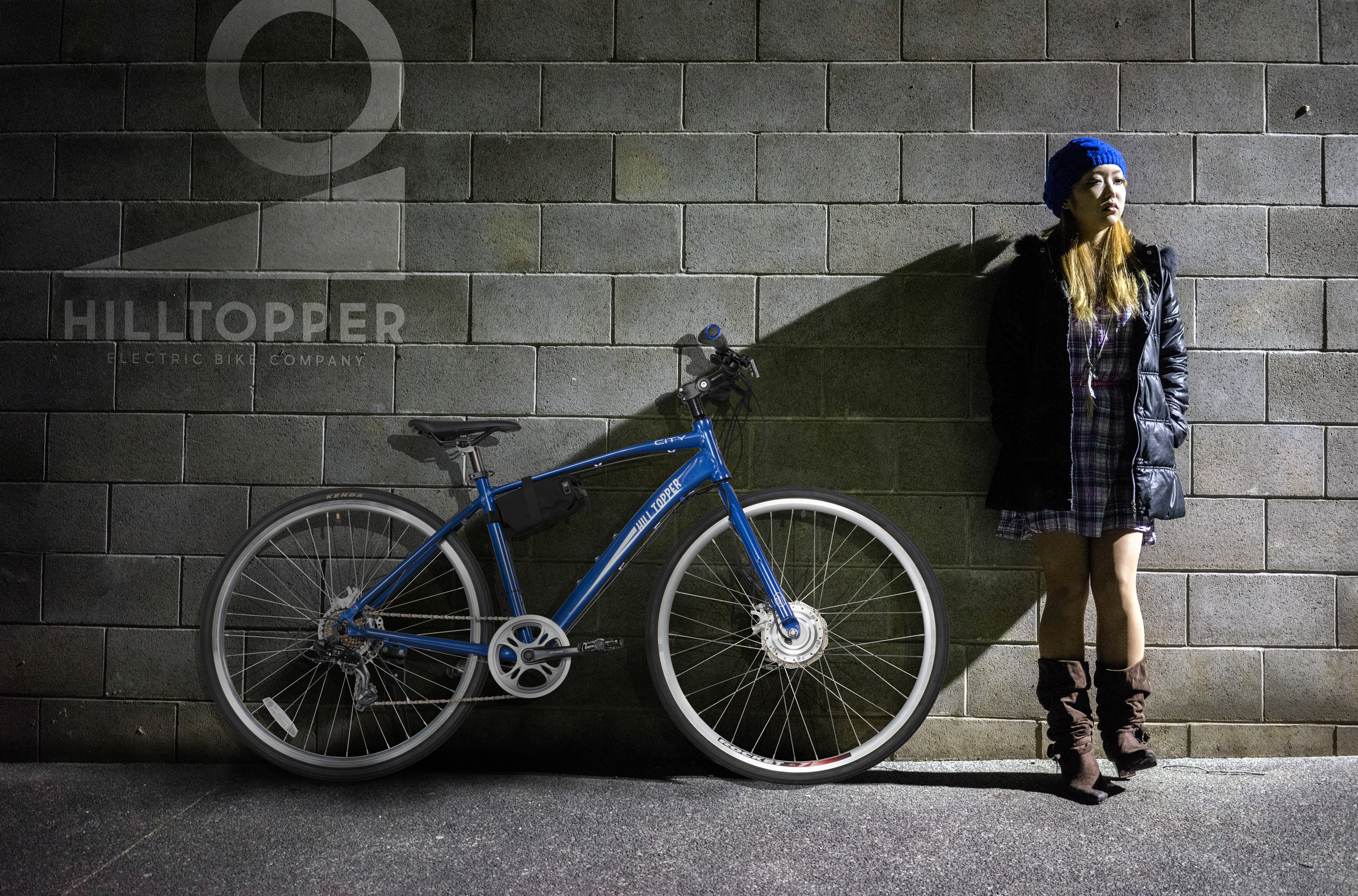
HILLTOPPER ELECTRIC BIKE COMPANY
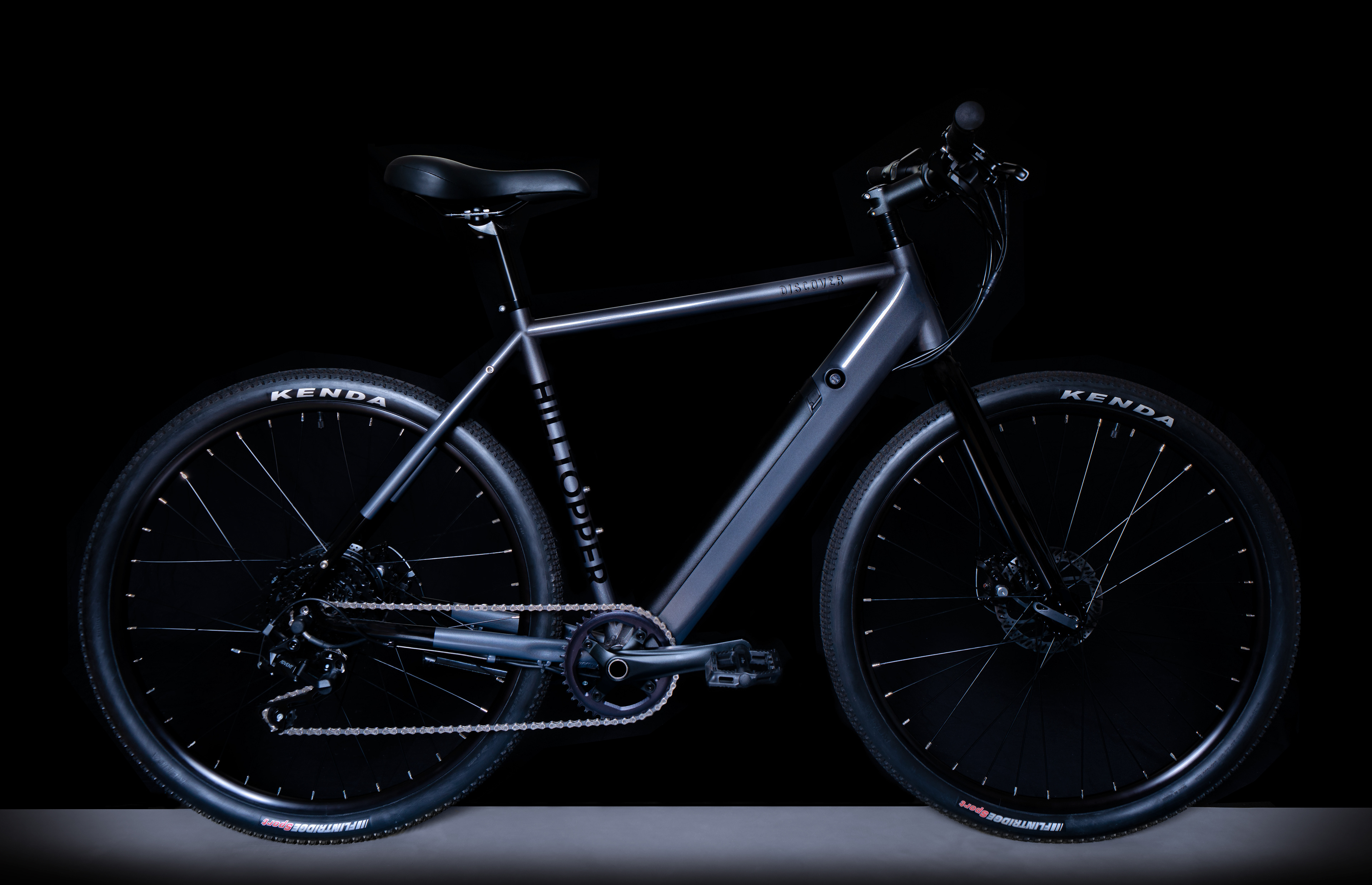
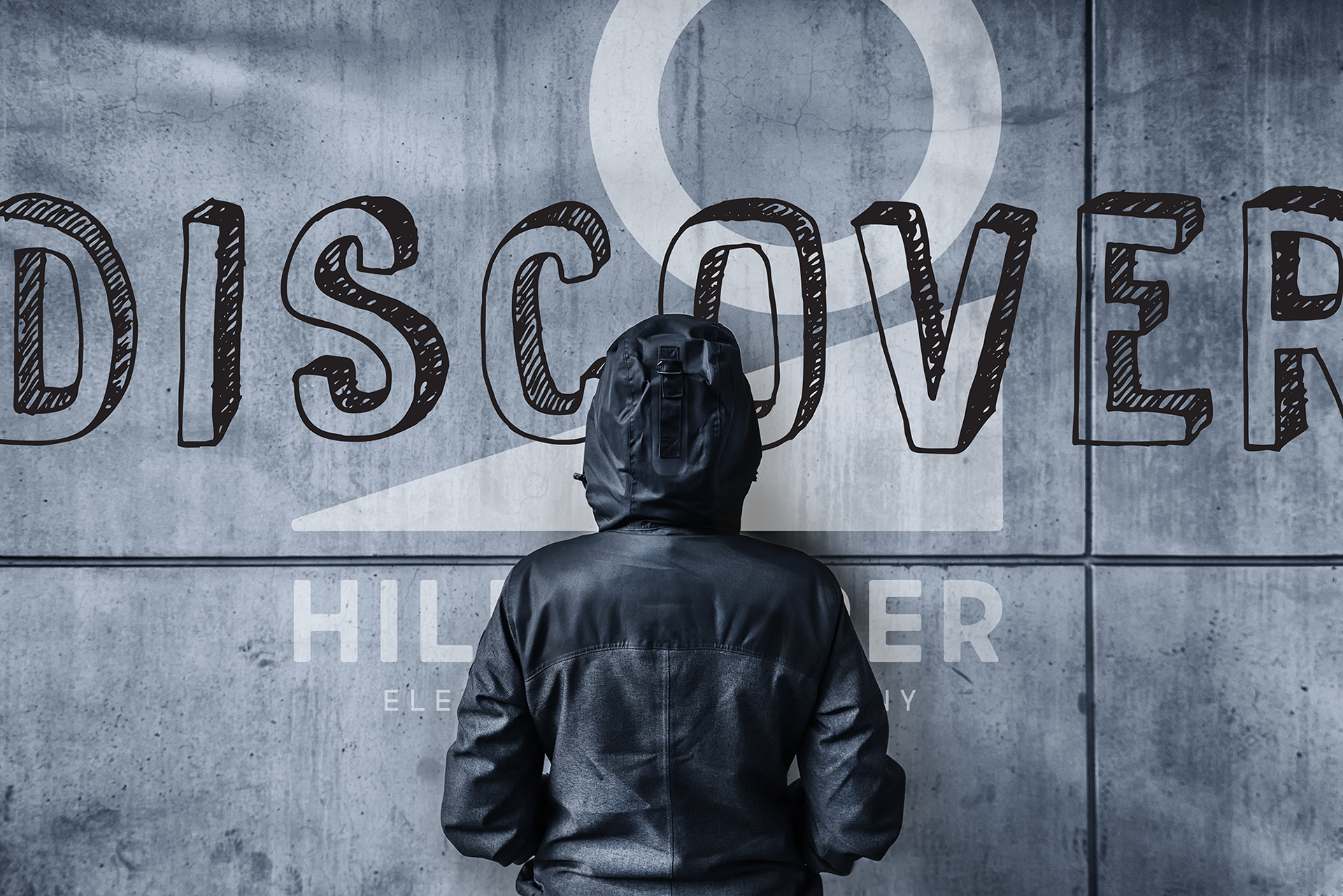
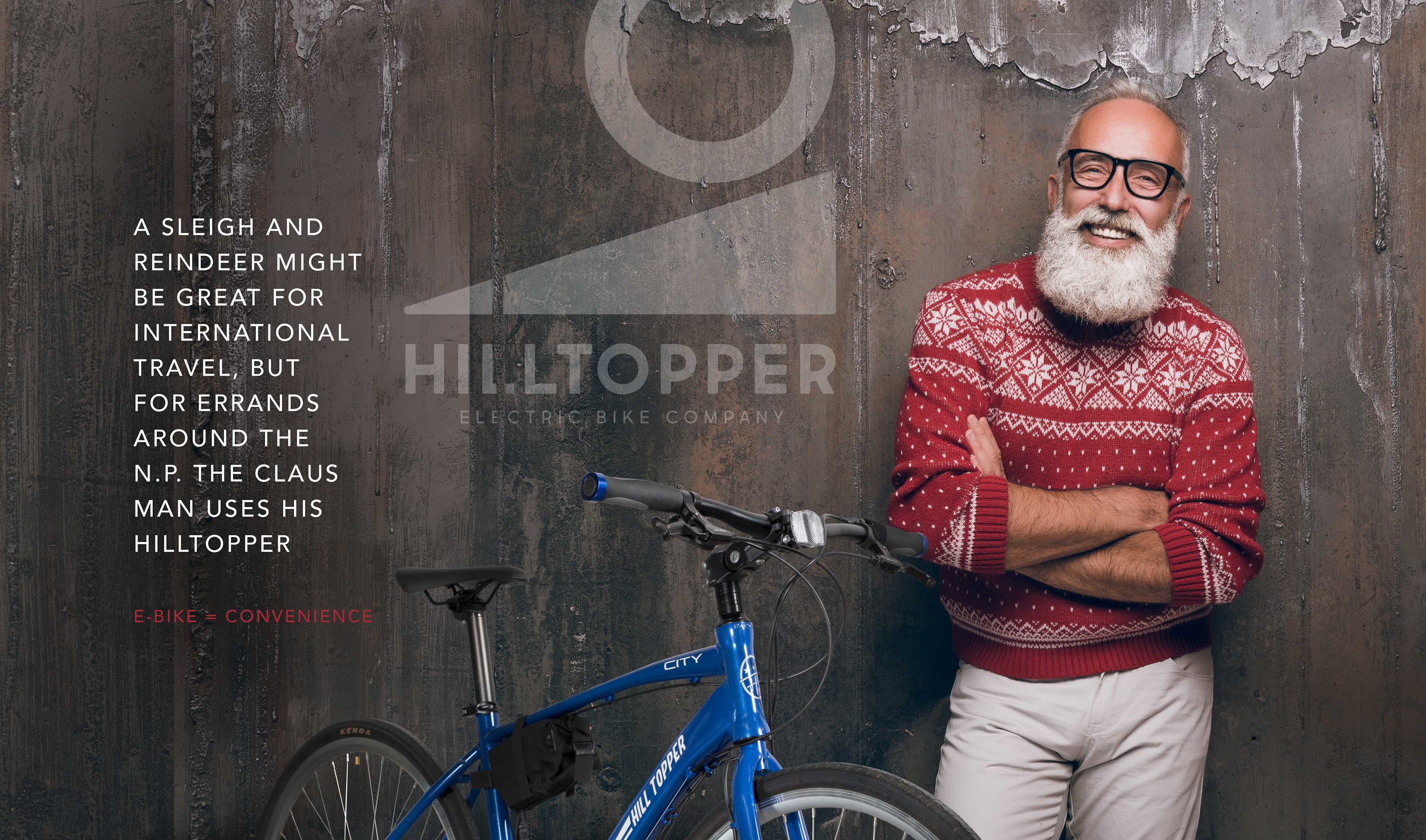
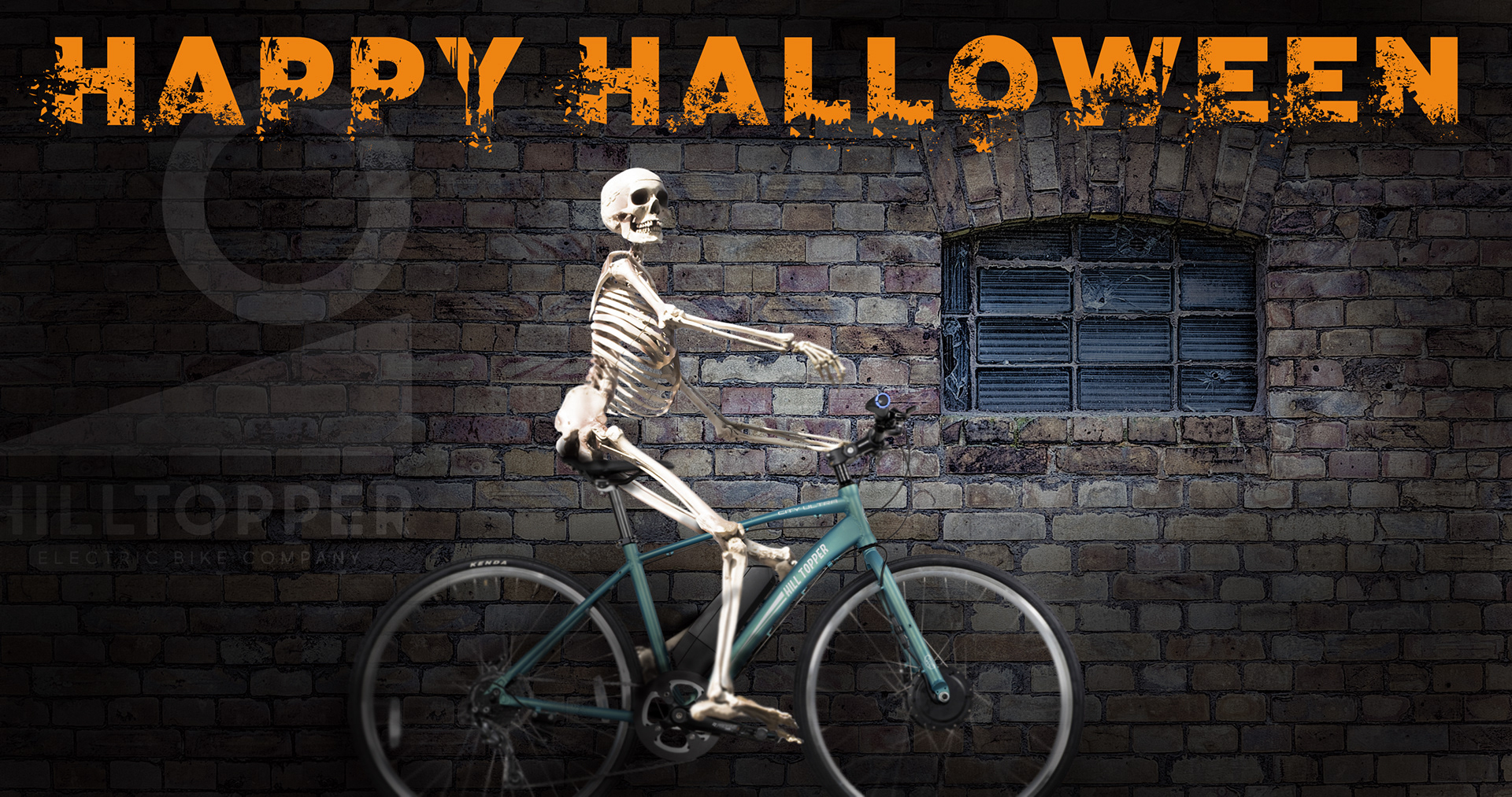
Hilltopper was one of the pioneers in electric bike kits back in 2008. Their original logo was uninspired and did not represent the brand they wanted to be. The logo needed to have a strong wordmark for easy application for bike graphics and an immediately recognizable design. I created a logo that has a modern vibe that would stand the test of time. The logo represents a wheel going up a hill without the literal illustration. It can be modified in fun and creative ways for apparel and other merchandise.
The below images were done while we still had the older bike models and were created in Photoshop with stock photography and in-house product photography.
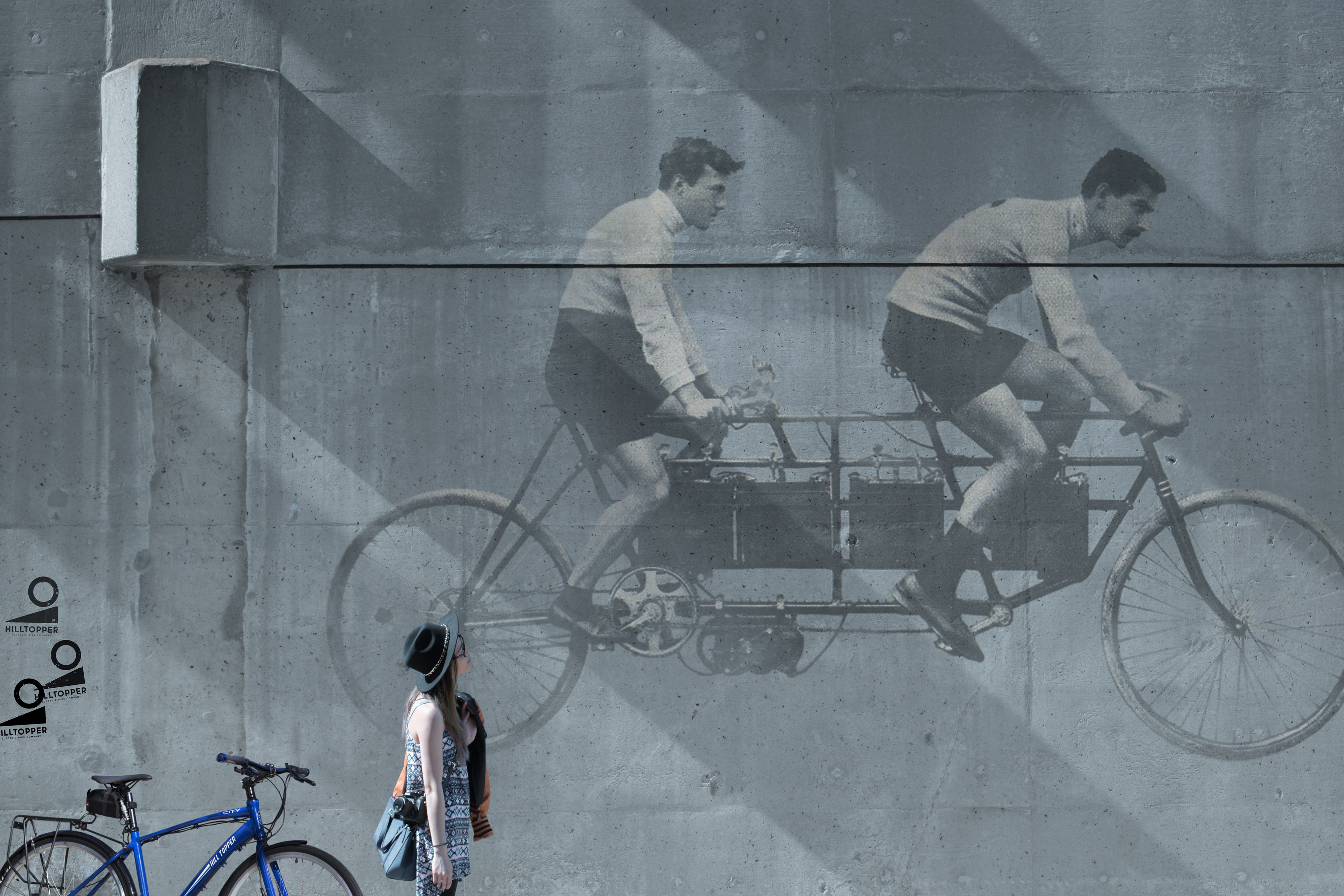
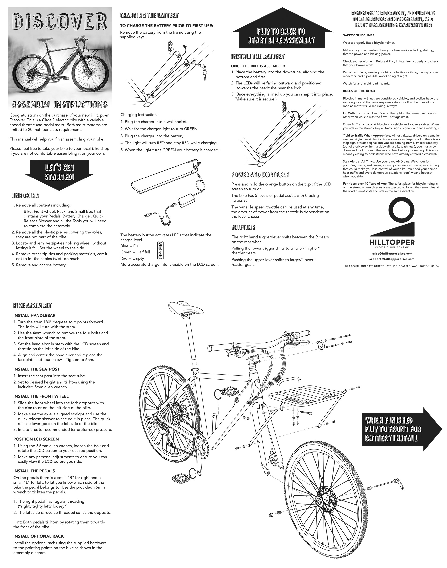
The images below are of the newer bike model where I did the graphics for the bike, documentation, and packaging.