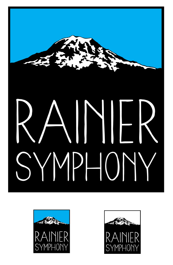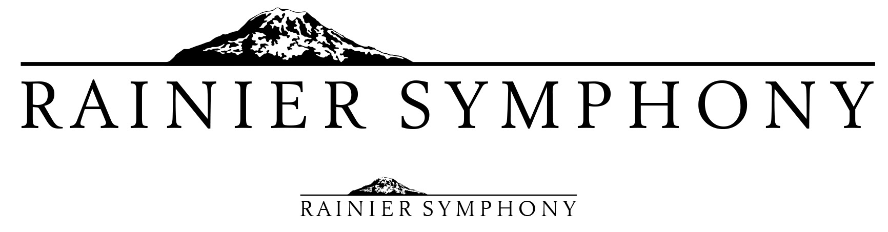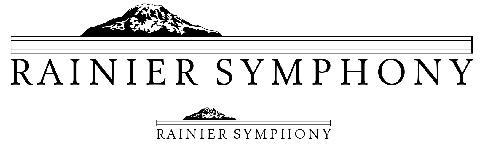
Rainier Symphony came to me with a project to redo their logo which worked but was cliched with scrolling text and a treble clef. They wanted something new without an obvious music reference, could work on merchandise and t-shirts, and was modern yet classic. They also wanted the mountain as part of the design. I created options that I felt met their criteria. Unfortunately the board of directors and the art directors could not come to a consensus as to what direction they would like to go.